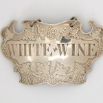
Labels
One of the attractions of labels is the many different aspects they display. These include:
Name or title on the label, ranging from wines like CLARET to obscure ones like MOUNTAIN, sauces from the well-known SOY to the obscure ZOOBDITTY MATCH, medicines, toiletries, boudoir labels.
Material from which the label was made, such as silver, silver plate, enamel, china or mother-of pearl, but not paper labels designed to be stuck on bottles – that is a separate field of collecting.
Maker of the label, though this is usually known only for silver and some enamel labels.
Where made - marks on silver labels can show the maker, the town where they lived and the date it was made. For labels in other materials, the design may give a clue.
The designs of labels are a particular attraction ranging from simple rectangles to ones with a profusion of decoration and shape. Often they reflect the changing styles and designs seen in larger items of silver or other materia
Design Reflects Changing Fashions
We illustrate some of these themes below in silver labels, grouped into broad time periods. Clicking on an image results in an enlarged picture of each label.
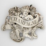 Early labels (1735 - 1770) showed the rococo influence which governed artistic taste in the that period, incorporating the scrolls, festoons and cherubs that mark rococo work in other fields. This label for CHAMPAGNE has a putto holding a goblet and, on the left, a bottle of contemporary shape surrounded by grapes, vines and rococo scrolls. Mark of John Harvey of London c1750
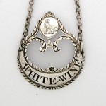 Neo-classical (1770-1800): As the taste for classical form gained favour in the 1770’s under the influence of the Adam brothers, silver designs reflected the change, and wine labels followed suit. They were produced in a vast abundance of elegant shapes, so that the last three decades of the century can with some justification be called the great age of wine labels, or certainly the most elegant.
 Exemplifying this is a label for WHITE – WINE shown above, a crescent with a family crest above, marked on the reverse of the label by Hester Bateman of London in about 1775.
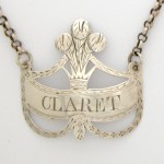
CLARET is an Irish label with formalised drapery supporting Prince of Wales feathers. It bears the mark of George Nangle of Dublin and was made between 1787 and 1793.
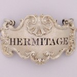 Regency (1800-1830): The taste for sumptuous table silver, encouraged by the Prince Regent, influenced silver and label design at the start of the nineteenth century. Fashion favoured ornate pieces, often heavy cast items of fine workmanship. Illustrating this is a cast Regency escutcheon with a shell above for HERMITAGE, a wine from the northern Rhone area of France. The label is by the Royal goldsmiths Garrard & Co and was made in London in 1823.
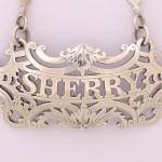 Victorian (1830-1900): A wide variety of designs appeared in Queen Victoria's reign and this is reflected in the many different designs seen in the wine labels of the period. However the number of labels produced fell off markedly after the 1860s when wine in bottles with paper labels displaced decanters from many dining tables and sideboards.
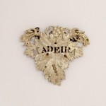 The SHERRY label above is a pierced cartouche in the Victorian taste. It bears the mark of Garrards and was made in London in 1839. Opposite is a label for MADEIRA, a single vine leaf shape, with the mark of Charles Rawlings & William Summers, London, 1840. Labels in the shape of vine leaves, both single and with several leaves, became tremendously popular in this period
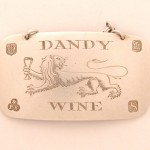 Modern (1900-2007): More recently silversmiths have been producing striking designs as evidence that this article of silver still survives as an elegant way of identifying the contents of decanters and as an example of the continuing freshness of design and skill of the silversmith. The whimsical label for DANDY [LION] WINE shows a 1970s style of decoration and engraving. It bears on the front the mark of Payne & Son of Oxford, the label tested and the hallmarks applied in Edinburgh in 1973.
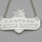 Even more recent is the label for CHATEAU LANGOA BARTON, a claret vineyard purchased by the Irishman Thomas Barton in 1821 and today managed by a descendant Anthony Barton. The armorial crest of the Barton family appears on the label. The label was designed by Michael Druitt, a member of The Wine Label Circle, and bears Birmingham Assay Office marks for 2004 accompanied by the mark of Wyard Druitt.
Silversmiths Marks
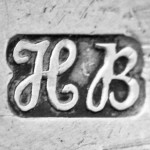 Each silversmith had their own mark, usually called the maker's mark. However the real intention was to indicate who took responsibility for the silver content being up to standard - 92.5% pure silver to 7.5% alloy to harden the soft silver. Today the mark is often referred to as the sponsor's mark and indeed it can be the case that a piece of silver is made by one specialist silversmith and then sold on to another who puts his or her mark on the piece - undertaking that the silver is up to standard although they did not make the piece. We show here, considerably enlarged, the maker's or sponsor's mark of Hester Bateman, head of a leading silversmith's business in the second half of the eighteenth century.
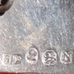 In the early years of silver labels, before 1790, the majority of labels were stamped (on the reverse) with only the maker's mark or with the maker's mark accompanied by the lion to indicate that the item was silver.From 1790 the majority of labels, at least those from the major centres, bear a full set of hallmarks. Here we show the marks on a label of 1807. The maker's mark is TW script, the mark of Thomas Wallis. The other marks are the head of George III to show that duty had been paid, the lion to show that the silver is up to the required standard and the date letter N indicating that the label was marked in London in1807/08 - the town mark of a leopard's head for London was often not applied to small articles like wine labels.
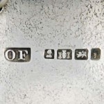 Outside London, labels from the major English centres - Birmingham, Exeter, Newcastle, Sheffield, York - usually bore full hallmarks too after 1790, though there are quite frequent instances of only partial marking. We illustrate here details of a label marked by Owen Fielding in Exeter. It shows his initials OW, the king's head showing that duty had been paid, the Exeter town mark of a castle, the lion showing that the label was silver and the date letter. While we have shown above two script maker's marks - Thomas Wallis and Hester Bateman - most maker's marks were in capital letters as in this example.
Unusual Names on Labels
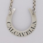 Another aspect of wine labels is the variety of names found on them. These range from the common such as PORT, SHERRY and WHISKY (the term wine label also encompasses labels for spirits) to the unusual such as EAST INDIA MADEIRA (Madeira that has travelled out east and back as ballast in a ship, the heat and motion enhancing the flavour)or CATAWBA (a red grape variety grown on the east coast of the USA). Here we illustrate a label for CALCAVELLA, a wine from Portugal. This bears the marks of the London silversmith Elizabeth Morley and the date letter for 1804.
